Podcast: Play in new window | Download
Subscribe: Apple Podcasts | Google Podcasts | RSS
Show Notes:
How Studio One came into being? [00:50]
Greg discusses his motivation for creating logos. [03:06]
How to ensure that your logo stands out? [5:25]
Is there getting away with quality content? [08:52]
Greg touches a little on how Google ranks web pages. [09:30]
What do we get from the spin selling formula? [14:21]
Why is identifying the kind of lead we are facing important? [18:08]
Greg shares about his experiences on email spamming. [22:55]
What are the psychological drivers of designing a website? [26:35]
How to effectively deal with visual hierarchy? [30:25]
Greg explains why simplicity and focus are important in creating a website. [31:50]
Viewing website in a desktop and mobile, how does it differ? [34:47]
Why is copyrighting important? [39:23]
Follow Greg Merrilees:
Website – https://bit.ly/2MncGxp
Facebook – https://bit.ly/2Mpn8ES
Twitter – https://bit.ly/2yFz9ny
LinkedIn – https://bit.ly/2Mkbr27
Studio1 Design Quiz – https://studio1design.com/quiz-steps
Narrator: Welcome to the Unfair Advantage Project - unique perspectives, practical insights, and unexpected discoveries directly focus on giving you the unfair advantage. Introducing your hosts Nadia Hughes and Terence Toh.
Terence: Welcome to the Unfair Advantage Project. I'm Terence Toh, I’m the managing director and creator of StrategiQ Corporation and this is Nadia.
Nadia: Nadia Hughes from Smart Business Solutions and I'm co-host of our Unfair Advantage Project.
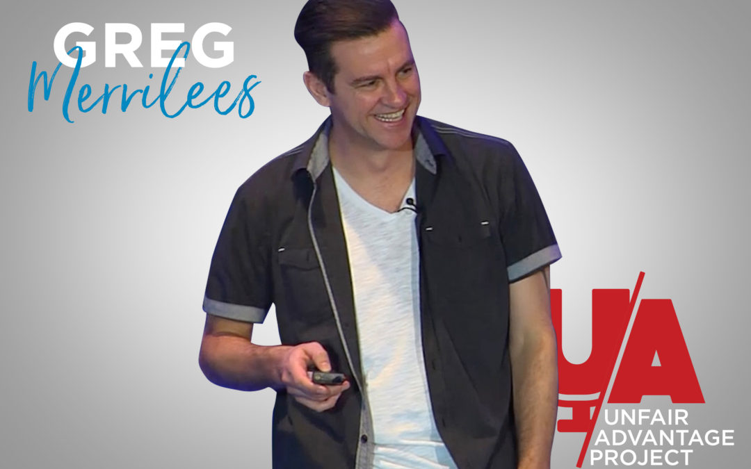
Terence: Yes, fantastic. And today we're interviewing a really good friend of mine, Greg Merrilees from Studio One design. How are you Greg?
Greg: Good mate. How are you? And nice to meet you Nadia.
Nadia: Thank you very much Greg.
Greg: I love that accent by the way. It’s very sexy.
Terence: We had a great conversation about who we're talking to today and then when I said we’re talking to Greg and Nadia said “So we're talking to Greg.”.
Nadia: Yes!
Terence: Yes.
Nadia: And basically that's your name.
Terence: Hahaha!
Greg: Hahaha I love it.
Nadia: For the next hour you will be called Greg.
Terence: Greg.
Greg: Cool
Terence: So yeah Greg. Tell us a little bit about who is Greg Merrilees and tell us a little bit about Studio One.
Greg: Yeah sure. Well Studio One we essentially design websites for influencers and marketplaces and things like that to get them a better result. But the way I sort of started in this I've had my design business since the year 2000. And back then we design t-shirts and did that for probably around 10,12 years before our wholesale clients who were selling t-shirts to the retailers like might Cotton On and Davy Jones and Kmart and all those sort of places, those retailers started going verticals. They squashed out the middle man, the wholesale and clients and of course they were all our clients so they were dropping like flies. And so then really, at that point I had an office, I had six full time designers and all these overheads. And it's like all my business is going to go down so I needed to pivot big time. So that's what I turned to podcast, podcast actually saved my life, my business at least. And so what happened was I listened to this podcast, I think I guess which was James Schramko and Ezra Firestone and they said in the podcast that they needed a new logo. And I thought okay I'm going to design a logo and just send it to them. And in fact I think they just said their logo sucked. I saw that as an opportunity. So I designed the logo and they ended up loving it and then they started getting me to design their websites and things like that. And then I hired James Schramko as my business coach, he’s still my business coach today. This is about five years later really. But yeah what I did then was with the logo design that are designed for them, I put it on to t-shirts and then I did. James Schramko said “Why don't you do the same thing for other podcasters?”. And so I did that. I sent a free t shirt logos and then everybody started to recognize that we could do this really cool logos. And so then it started attracting more people that had podcast. And then we started designing websites for their communities as well and just sort of snowballed from there.
Nadia: And when you design a logo, what's your starting process? Where do you get this idea from? I guess it's a very trivial question but for me, a person who never designed the logo, I want to know how it all starts in your head.
Greg: Yeah! Well because I've got that T-shirt design background, the first thing I want to know is does this logo or will this logo look good on a T-shirt. Is it cool enough to wear on a T-shirt as a stand alone thing? But then also you want to think about a logo from the point of view that it needs to represent your brand, your brand values and it really needs to talk to your target customer. So what we would do is start with a 20 or 30 questionnaire to really dive deep into the business that we're designing or the brand, depends it might not necessarily be a business all the time it could just be a brand within a business, to really dive deep to understand more about that brand and the core principles and those sort of things. So yeah. From there we would then go away and research it. So for instance, if we understand your target market, let's say women in their age 40 and their based in this location will sort of research where they hang out and we'll try and figure out what they're in to as far as it might be the music choice or you know just things that they like – food, whatever. And then we're going to understand more about that target market. So then what we're going to do is design something that is going to suit that target market. And so then from there we'll send some logo concept to the client and then get their feedback and we make unlimited design revisions on everything we do. So we just keep giving new versions or tweaking it until it's approved. Sometimes we hit it right out of the park from the start because we've done all that research.
Nadia: And like you mentioned 40 year old woman, she hangs out main street morning then likes coffee and everything, what's your starting point would be? Well obviously children and your husband is in the business and she's helping him out. What questions to use to design your logo because I'm talking about businesses who are electricians. Also we have plumbers and we have these type of traders businesses as well as client-based.
Greg: What are the logo?
Nadia: Yeah.
Greg: What are the questions I would ask them?
Nadia: Yes! I just would like to know because there are plenty of electricians out there, there are plenty of plumbers out there. I'm picking most generic business as you can pick but they, would you believe or not, majority of client-based could be for some accountants or business coaches. So how would you design logo for them to differentiate them from each other?
Greg: Yeah so that's the whole thing. We would look at their competitors as well, right? So we would work out what their competitors are doing, what they look and feel is for their logo. But generally what we're trying to accomplish is a look that is different to their competitors and is unique to your business so that's why the research phase is so important because we don't want them to look like everybody else. And so to answer your question it's pretty hard to give a solid answer of how we would design each logo for each individual business because there's so many variables in their answers so it's only after they've answered every question that we would be able to give them some concepts. So each business is so unique that we don't just have a blanket, template for each business style.
Nadia: Okay well I understand I asked a very challenging question for you and you couldn't produce simultaneous on spot logo for me. That's a bit the downfall of a podcast but anyway, Terence do you have any questions about logo?
Terence: Look we're going to talk about really some ways that we can really get people's websites rocking today. We want to give some great information to listeners out there on some simple steps that they can go through to really get their websites seen. Maybe make it a little bit unique as we've been talking about with the logo and what type of thing. So Greg, what's the first kind of a step to get someone come to you who needs a website design whether they've already got an existing website or not. Where did they start?
Greg: Yeah. Well first I just want to say that with the logo thing like it's really, it's a small part like it's not the first thing that I would get done if I was starting a new website for a new business, right?. So really the logo is a minor thing. It's something that you can develop over time once you start making money. But from my point of view it depends on the business style, right? Like if you're a start-up business then I would say just go get a template website you know until you're actually making money and you have an offer that converts. Don't spend a fortune on their website. So we only design custom websites and they're not for start-up, it's for an established business. So if you are established business and you're looking for a website then the first thing I would do is look at their folios and make sure that their folios resonate with you. But then take it a level deeper and try and work out if their folio has conversion elements and by that I mean things like a marketing funnel and a lead magnet and all these things are going to help start a conversation with a, with the prospect essentially. And then really a website design is something that's never finished. It's always evolving. And so you just want to put something up in the first place. I mean I wouldn't worry about it being perfect. I'd be more worried about attracting people to your website by releasing quality content in the form of blog post, podcast, videos, etc. And then you wanted to start a conversation so you want at least capture or try to capture an email address in return for providing value.
Nadia: And when you're saying quality content, what would you consider quality in the modern sense?
Greg: Yeah.
Nadia: What's going on now? Because whoever started their own website, you probably cringe from the mistakes you say if you have to check or do health check of website. So let's define quality and them jump into the most common mistakes you see if I may ask this question.
Greg: Yes! So look. If you're talking blog post or even like podcast like we're doing right now. Okay so there's obviously a lot of, what, the goal is to provide value to your audience right. So don't just put up like a 300 word blog post or a really short podcast. Pick one topic and become the expert on that topic and you probably are an expert. But what you want to do is research that topic even if you're an expert to see what's already been done online and don't be like what's already done online. Try and be original. And you want to say quality, I mean try have at least a thousand words in the article because these days Google is looking for quality content and they'll rank your website if you've got big, chunky tall, blog posts that have things like quality designs within it like images and even video and audio and all the different mediums that you can put in there. The better quality that Google's going to say it is and say with you or your viewer as well. Like they're going to be able to engage with it for longer if it's got a lot of information and different ways to consume that information.
Terence: I like the fact that you said engagement and you know. And one of things he said was start a conversation with your audience and I think that's very relevant.
Greg: Yeah.
Terence: I think you see some examples of marketing which is just pushing a style onto someone and that what you said there start a conversation and actually see where that goes. Provide value along the way. And then someone might actually make a purchase as a result of all that value you've already provided. And understanding that maybe getting a really much better understanding of your business.
Greg: That's right. Yeah.
Nadia: It's almost tells me that when people hop-on somebody's website, you have to respect their time and give them as much as quality content as possible in their spare time because you can lose them forever and then never ever will come back. So I think it's your one chance of making the impression.
Greg: Yeah, that's right. And one of the mistakes that I say people make is they don't lead with value first. They try to sell on hello buy the stuff. I mean obviously if you've got an e-commerce store that's a slightly different story because people are there to buy products, right? And depending on the, I guess the age of your business and the authority of your business, then you know you can sell on hello. But the majority of the time for small businesses that are trying to make their mark, then you don't want to sell on hello. You want to lead with value first. And that's why we say to have a lead magnet and a bit of a marketing funnel to help warm people up over time especially for services businesses.
Terence: Cool. So tell us maybe a little bit more in depth what that involves. So when you're looking at writing a good lead magnet for your website, good marketing funnel, from your point of view, particularly the design point of view which is where you're coming from, I guess. And actually, one of the other areas that I'll probably note that I at least think you're very strong on is designing websites that actually convert. And we've had some conversations in the past around, instead of just designing a website that looks nice, you actually design website that helps people to know what to do next, that helps them to go through the next steps.
Greg: Yeah, hundred percent. Yeah. So that comes down to the visual hierarchy of the design. So just to sort of break down a home page, the way we like to design a home page is to take Nadia’s point before that people have a very short attention span. And you need to sort of get their attention within five seconds. Normally if you've got a cold prospect that's come to your website, you've got five seconds to capture their attention and all they care about is them, right? They don't really care about you or your business at this point. They only care about what's in it for them, so. And what you want to do with the section on your home page above the fold is try and capture them emotionally like have some form of a hook and this is where copywriting is so important because a mistake I see website owners is they like they copy themselves and it's all about them, and blah blah blah, boring boring, welcome to my website. That sort of thing and you don't want to do that. You want to leave with value first and you want to have a headline that hooks them emotionally. And then shows some benefits to them, right? What, for what they all get out of interacting or engaging with your business. But then you just want to start with some form of a lead magnet which would be and we're still talking above the fold, right? So when you first land on a home page we're talking the section that you see without having to scroll. And so on there yeah you would have the headline, some benefits, a lead magnet. It could be a P.D.F. or a free trial. It could be a quiz or a challenge or join a fee club and get benefits. Another thing I've seen lately which are a game of fire lead magnets, there's a tool called Wheelio which you can spin the wheel and then you'll land on one of many lead magnets. So it's good for businesses that have multiple lead magnets, this is pretty cool. And then yeah really this is still all above the fold. You want to have a little bit of social proof. Which is in other words some testimonials, as seen at, as heard on. Something that's going to show your authority. And then I also recommend having a video above the fold and that's a lot to fit in there. So normally we wouldn't have the actual video there but we'd have a play icon and then when pressed there'd be a pop up to show that video and in that video just touch on it briefly. Videos are super important for building trust especially if you have a face to camera video. And but you want to talk about what we call the spin selling formula which is based on a book by Neil Reichling called, you guessed it it's Spin Selling. And what this is really is just it's an acronym and it shows people that you really understand their situation. So that's for S. And then P is the problem so you understand their problem. And then I is the implication. If they don't do anything about the problem, what the situation will look like. And then N is the need or the pay-off which is your solution to the problem. And it's also good if you can sort of throw in your story and sort of explain why you created the solution for them and then give them a call to action at the end and it's usually just to take the first step in the funnel. Whether it's the e-book lead magnet, webinar, that sort of thing.
Terence: I was introduced to spin selling by James Schramko. Well I'm assuming that's where you shoot it.
Greg: Yeah! Yeah absolutely, yeah. And he uses it for pretty much everything that he does in his marketing from podcasts to webinars to stage presentations. It's a really good framework.
Nadia: So if there's a,
Terence: Solution.
Nadia: Solution.
Terence: Oh situation, sorry. Situation.
Nadia: Situation.
Terence: So what I understand the current situation.
Greg: Yeah.
Nadia: What problems they have? What’s implication your solution if they don’t have and address their need.
Greg: Yeah. Yeah. Yeah. And the implication if they don't take action, because you sort of let them know that their situation might change. Just reinforcing that fact. Yeah.
Terence: Yeah and sometimes that's the worst outcome, right if nothing changes?
Greg: Yeah totally. Yeah hundred percent.
Nadia: Because some negative event changes can lead to some positive outcome.
Greg: Well.
Nadia: But exactly any form of stagnation is death to business.
Terence: Well, especially if you're not currently getting a lot of good leads or you're not currently getting good conversions. The worst thing you can do is leave it at the side.
Greg: That's right. Yeah, exactly. And so this type of things, if you're looking for a new website, you need to look for in a design Folio. I mean really, because obviously the website is the first place where people go to check it out. If they have heard of your business but then there's actually one point three billion websites online today and that's actually doubled since 2014. So you can guarantee whatever niche you're in, there's going to be a lot of competitors in there. So yeah, you want to make sure that your website is not just an online brochure, it's actually designed with conversions in mind.
Nadia: And out of this vast amount of website, how many of them do use the el?
Greg: I wouldn't have thought.
Nadia: That, that would be
Greg: Too many.
Nadia: Interesting statistics for you.
Greg: Possibly.
Terence: I'd say a lot.
Greg: Yeah.
Nadia: I just wonder if you, and when you're looking using professional eye, any website, will you be able to tell whether they've done it themselves or someone did?
Greg: Oh yeah, yeah. hundred percent. Yeah. And that's one of the services that I'll offer is to review a website. And there's a lot of things that I'll do when I'm reviewing a website. But one of them is just to check out this tool called builtwith.com. And you can have a look at the back end of the website and see all the plugins and what framework and so on, and things like that. So for a start if you see that it's on Squarespace or one of those type of things, they've done it themselves.
Terence: Good point. So, alright, there's really a lot in there and I guess we're dealing with just pretty much when people get to your website. This is, these are all of the things that they should be seeing or that you might want them to see or you might want to include at least, right? What happens from there? So you've got some sort of lead magnet, some sort of offer happening maybe something to engage and start a conversation. Where do we go from that point?
Greg: Yeah! Great question. So you know what I like to do is design a website that has something for cold leads, something for warm leads and something for hot leads, right? So we've talked about the cold leads which is be that free PDF or whatever I said before, free trial etc. But then you want to have something for warm leads. So these, and by the way your content like your blog post or podcast or whatever is for cold leads to warn them up, right? There is no better way to warm up a cold audience than having a podcast for instance because I get to know you. So that's a really good tool. But then you want to take it to the next step and like if somebody have seen taken to a thank you page that has your next offer. Okay so what we do, and a lot of our clients do, we design some websites for some pretty high level marketers and we’ve designed about fifteen hundred websites over the last four years. So we get a good idea of what's going on because we see so many amazing funnels from High-Level marketers that are making millions, right? So you want to have something like a webinar or it might be, you don't need a huge funnel sometimes especially the service business. You can just offer a free consultation chat or something like that. Right? But then a lot of designers they don't understand how important that thank you page is. And to me that's absolute gold real estate. Your prospect has already given you their email address so they're in the habit of saying yes and a lot of designers will just have a little note saying hey thanks for downloading the PDF check your email and that's it. But I'm going to say have a video on that thank you page, face to camera video. And then just thank them and let them know what they can expect from whatever they opted in for and then offer them the next step in your funnel. And if it's a webinar, briefly explain what the webinar is about and give them a call to action at the end. And which might be a button next to the video or below and just tell them what to do. Click that video and look forward to helping you soon or something like that, right? But yeah that thank you page will take then to the warm sort of lead magnet, that's what I call it anyway.
Terence: Okay. So you kind of, you’ve take someone who know absolutely nothing about you, potentially which is the cold lead.
Greg: Yeah.
Terence: Now they're starting to get to know your business, what you do, what you're about. And now as you say if they opt in to receive more information, it’s probably the perfect time you say to give them some type of an offer.
Greg: It is. But don't expect them to take it up straight away. Like that's another mistake. Some people just leave it there and they don't email them, they'll send one email. But it's really beneficial to respect that they might have other things going on in their personal life. They may not have time to do this so you want to back up your, send them the first lady magnet - the cold lead magnet. But then what I do I have like 20 email sequence now to warm up those cold leads because we sell high ticket items essentially. So it depends on your price point but you might only need five. A sequence of five emails. But yeah, just, in that e-mail sequence the goal is to keep providing value with the angle to build trust to get them to think of you like you be top of mind if they're ready to purchase your product or service. So you don't forget to email them because they might not be ready to take that action on the thank you page.
Nadia: This 20 email sequence, the audience feel a little bit spammed. We just had the campaign and we've all done is sent them about five reminders. And we have a couple of people whining about it. So I'm just horrified looking at 20 email sequence.
Greg: Yeah and that's a good point. But Terence and I just came back from traffic and conversions. And one of the big difference between Australia and the US is that they expect you to send them a lot of emails in the US. We don't expect that in Australia. But if people are going to get annoyed and unsubscribe, that's fine. That's what you want. They're not your target customer. They're not ever going to be a buyer right. But I'm not saying send 20 emails in 20 days. I'm saying 20 emails over a long period of time. and for me it's 20 weeks. So we send one a week. That's just our nurture campaign. But then if we're creating new content, then I'll also send them a link to that when that happens as well.
Nadia: And at what point you will be considered an aggressive marketer vs. a mild soft marketer.
Greg: I would say when email servers put your emails in junk email. That's when you know.
Terence: It’s not a pretty much guarantee though.
Nadia: So it has happened to you?
Greg: Yeah it happens to me. Yeah.
Nadia: What have you done? How many did you sell?
Greg: No, I don't. Look, honestly I sent about one or two a week max. Right? But some email servers see that as a marketer and even though I'm providing value.
Nadia: Did you get a notification that you become a spammer mailer officially?
Greg: No I just get emails or calls from my client or whatever saying. You haven't sent me this email yet. And the reason is because some of my marketing emails will go into spam and therefore those email service providers will see my email address as spam and therefore they'll block some of my emails going to my actual clients which is super annoying.
Nadia: Okay what do you use to avoid being marked as a spam email. What is it there?
Greg: I'm not a mail expert. Sorry!
Nadia: Ahh okay. Interesting.
Terence: But we'll get an email expert I guarantee.
Nadia: Now you're making me want to get one. You did brush quite a bit on cold leads. Podcast, you said, could be ideal. It’s basically an introduction curiosity. This is where I consider cold leads. Warm lead when they are curious enough to want more. And what would be on warm one, one thing you should suggest to take?
Greg: Yeah. I would say anything that's going to give them some time with you. That could be a video series, right? It could be a free video like a webinar or could be a 15-minute consultation. And then have a face to camera like as in Zoom or Skype type of meeting with them. Unless you want to have impersonate that type of thing. Or you might also invite them to a live event. They can be super powerful. As nothing more powerful than made somebody want to want to try and build that relationship and trust.
Nadia: And then you talked about hot leads which you did tell again its webinar, free consultation chat. But it has to come your best so far. So how my warm leads tools will change from warm to become hot? Hot audience. What would I be doing?
Greg: Yeah. So you offer your paid products.
Nadia: Okay so this is paid products.
Greg: Yeah, yeah. Product, services at that point. So you want to have all these things on your website and obviously you want to have a funnel as well to take people from cold to warm to hot. But you don't want to take them through the funnel if they're ready to buy to try. Right? So you want to actually have your products and services on your website ready for them to purchase. But don't expect them to purchase from a cold lead. It just doesn't happen very often.
Nadia: I think it’s a good idea to be very specific on what you offer. Does the market services packages, and the price? Or do you have to somewhat indicate that? What's the best methodology to put this type of offers is out there. Do you have to be very specific?
Greg: Yeah it depends on the business. You do need a landing page that has a certain structure to it for your particular product or service, right? So and it does vary from business to business to the structure needed. But for instance, even if you're selling physical products, a lot like I signed up before, a lot of e-commerce, businesses so on. Hello and they get amazed that they don't get amazing results. And so for instance, given an example there's a product called Organify. It's three years ago, they used to sell about three thousand dollars worth of product a month. And then we redesigned their blog website, their blog website they just have this thing called mindset. Mondays and something else they do on Fridays and they're really two bits of blog content per week, right? It's a totally different website but this website is designed to build a community of people through their amazing content and then they just have one little link to their organify shop and that boosted their sales to over 2 million dollars a month. So it's all to do with leading with value first. And so if you're just selling services, there's different structures that you would need. But on those pages you would need to use what we call psychological drivers and these things are things like social proof, sharing your authority, consistency, reciprocity even scarcity as well, urgency if you have a limited time offer. But don’t use fake scarcity. Don't use a countdown timer and get them to take action for them to find out later that it was fake and it resets the next day.
Nadia: And this is what brings very home to me because I had to see these fake urgencies and which just basically people put limited offer which goes on forever and contradicts this is actually astounds me. Well but people still keep doing it.
Greg: It's amazing isn't it? But yeah that's you know. You’re going to lose trust if you do that and you get caught. It's going to be really hard to win that trust back. So just don't do it.
Nadia: Trust. And another thing while I was listening to you it appears to me that you’re creating somewhat a wisdom from an introduction a complete stranger. You almost want him to be part of your company and you’re creating a community around these big is you blogging with them then and you do all sorts of things. So you from treating strangers you're welcoming him into your website and you have to start a serious affection. You have to convert him into your best friend or your single-minded community member.
Greg: Yeah hundred percent. And really it's just like the offline world. When you meet people, you just want to take it easy to start. You don't want to ask them to marry you. On the first date, you want to take it easy. You want just to know them.
Nadia: Unless you come to Australia.
Terence: Hahahaha!
Greg: Hahahaha!
Hence it is the male pride or service which is quite good. Well don’t discount this one.
Terence: Hahahaha!
Greg: I love it.
Terence: I think we just got a new topic for the podcast Greg.
Greg: I think. Yeah. But it's really like Terrence picked up on before.
Nadia: Like they just say yes or just like because they're just so overwhelmed.
Greg: Yeah. Well people. They don't want to be sold to. They want to purchase when they're ready to purchase. You know what I mean. So for me it's all about just building trust. And obviously you want to leave with value first. But touch on these psychological drivers as well and these things are super important to get people to want to engage with you. And one of the biggest things is show in your authority. Right? And no matter what niche you're in there's a lot of things you can do on your website to show your authority. And even if you're trading like just having a photo of yourself and you might be on the tools, you might have your fleet of vehicles behind you, it's going to make you look like an authority. And if you're a doctor, or an author, or speaker, you want to let people know those things as well on the above the fold section. And then as well as authority, social proof is kind of goes hand in hand. So let's say you've got a million followers on YouTube and you've got hundred thousand on Facebook or whatever the case is, you want to show people that you want to show them in the form of numbers that you've got all these different followers and once again these things don't need to stand out on the bit above the fold but it would just be a little monochrome kind of section so that people can see it but it doesn't compete with the main call to action and that's where visual hierarchy is important.
Terence: So let's talk about visual hierarchy a little bit more.
Greg: Yes, sure. Well so basically what you want to do is. There was a trend a couple of years ago where people were using what's called a ghost button for instance, right? And a ghost button is a button that has no fill and just has a thin line around it. And then when you hover it might turn to a solid fill, right? But that was a trend and it looks cool, looked cool at the time. And I was using it as well. It just didn't convert as well and the reason was because it didn't stand out. It wasn't contrast enough. So when we're talking about visual hierarchy what you want to do is have enough clear space and contrast around that call to action button to make sure that that's the thing that stands out the most. Right? Then obviously people want to know what's in it for them so your copyright writer needs to hook them in and show them how they benefit and then give them a call to action. And if possible, apart from the home page I only have one call to action on each page. Just give them one thing to do. A home page is really a gateway to get to know all of the important pages on your site. We can talk more about that structure if you want but visual hierarchy is just arranging things in a way to put focus on the things that you want them to do. A lot of sort of do it yourselfers have too many things going on so it's really, for somebody listening, now just look at your website and just think about what you can take away to put more focus on the important things.
Nadia: I call that clutterama. You walk into some web page and you just don't know where to go. There’s just so many bells, whistles and you're just. It’s too busy that you'll get overstimulated than the five seconds and you just want to shut that down that's all. You don't want to stay there. And vice versa when you come to a very clear page which just takes you, explains you something, gives you one well. It's this very easy to navigate and keep it simple I think. Comes back and work.
Greg: Simplicity is absolute key. I mean you still need to show your authority. You can't be as simple as like say Apple for instance. They just have beautiful photos and that's all they need right. They've already got the authority. But if you're a small business you do need to show your authority and have social proof to let people know, like social proof is so important to let people know that other people think you're awesome without saying it yourself. But Apple don't have to have any social proof on their website, right?
Terence: I love what you're saying and that focus. It's funny because I guess when I work with business owner, one of the biggest challenges I see for them is that focus. It just appears that there's so much going on constantly. It's almost natural for us as humans, I guess, to want to be involved in all of that. What you're saying is don't let that translate to your website. Let your website be focused. Let someone who comes to your website understand what the next step actually is they can do, right?
Greg: Yeah, yeah. Exactly right. Yeah. I just say yeah so many people get that wrong. And it's like a business in general especially when you started now, you're going to pivot, you're going to try this and that and it's hard to stay focused. And that sort of reflects in their websites especially if they do it themselves. But yeah if you reduce the clutter and just keep the important things then it's going to increase conversions. But there is one thing I wanted to touch on and that is we design websites for desktop but also it needs to be designed for mobile devices, right? And there's a totally different sort of approach between the two. And even though the website so the desktop version will have all these psychological drivers and a look beautiful, have images, and backgrounds, and all that sort of thing. By the time it gets sort of converted responsively so it would be one website designed to be a design that sort of looks good and large on a desktop but then as a screen size get small things, it stack and scale and move around. But as you get to the smallest mobile, usually you need to focus more on speed first rather than beautiful imagery. You want to make sure your copyrighting is gold but it's more important to have copyright and social proof and things like that and clear call to actions as opposed to having all of the visual stuff that you would have on the desktop view. And that's because Google will rank your website via your mobile version of your website first though they've announced that this year. So it's more important to get it right on your mobile. Another thing is you want to think about, and this why do you do it as well, is you want to think about your visitors. If you have lots of images it takes a long time to load, so that's going to annoy them as well so you just want to get to the point and remove as much as possible on the mobile view.
Nadia: So what you’re saying is there is desktop version and mobile version. They will be sort of its filters into mobile version and drops off a few features, is it right?
Greg: Yes, spot on. Yeah exactly right yes. So it's just one website. It's coded responsively to drop off those features as you get smaller.
Nadia: The tendency now actually go. I think you just don't want to rob Duplay Peter. Yeah this kind of stuff. So there is best version which is these bells and whistles and they are magnificent but what I see happening people go so heavily now on mobile version because they think it's has to be mobile friendly. They actually design entire website being mobile friendly only and miss on other parts of desktop which is important. That's probably something I haven't thought about but I see as a tendency.
Greg: Yeah and look. Responsive is the best solution. You can do a mobile-dedicated website but it's not as effective as having one actual website that's coded responsively to stack and scale depending on the screen size.
Nadia: Is it hard to do?
Greg: No! I mean I don't I'm not a coder so I'm just a website designer and a brand designer. But yeah we've got 20 people on our team and we have I think six coders at the moment so yeah that's what they do. I don't know how it's done.
Terence: But it’s not hard to do cause you can just give it to them to do.
Greg: Oh there you go. Exactly, exactly.
Terence: It's the who question not the how question, right?
Greg: Yeah, you bet yeah. Good point coach Terence.
Terence: So I just want to point out at this stage I think we've gone over some really good information. So it's been quite dense and Nadia has two pages plus another three quarters of a page of notes.
Greg: Oh wow! Hopefully that's helpful.
Terence: So I think Nadia is going to be implementing some of this at some stage.
Nadia: I talk to clients a lot and quite often I am not a website designer nor I am a specialist in any form or shape as a marketer. However, what I'd have to point out a few really key areas to my clients would have to pay attention too because this is what triggers them to think about it. They have to create sales. They have to create customers. And when I see revenues not moving, we just stagnate as a business. I have at some point of time ask this question. What are you doing? Why no leads are coming? Would you like to see a specialist then this is where I am like a GP. I am sitting there and seeing all symptoms of poor behaviour of the business house and then I have to refuel how I see my core specialty. And referring not just go talk to this guy but reveal the reason what I don't see happening is you're not growing.
Greg: Yeah, yeah. Look, having all the things we've discussed super important and that's why we share our knowledge to help more people. So yeah just implement what you've learnt here and you're going to have a website that converts.
Terence: Yeah. So just quickly back to the mobile responsive website. We talked about with your website having a focus on one thing. Whoever's looking at your website for that person looking at website a focus on one action. Is that more important when you go to mobile and a mobile responsive site?
Greg: It kind of depends on the target market because and what they're for in the first place cause, and this is changing a lot of time and people will sort of discover a website on a mobile they use a click on Facebook add or they'll be surfing the net or just whoever they find there. But then they might just, normally they might be in the bank queue or they might be I don’t know on a train or something like that. They're not really in the mode of purchasing a lot of the time. This is changing though, right? But the trend is at this point that more purchases still happen through the desktops. So yeah it's important to give them just what they need to know so that you know they're engaged and maybe they take the first step or they engage in your contact with other cases. But then realistically, another thing you can do is use remarketing. Right. So if people visit your website and they don't give you an e-mail address, and that can usually happen on a mobile device, you can retarget them with ads from Facebook or Google etc. Meaning that even though they haven't given your email address because they visited your website from that point on you can create ads like visual banners that will follow them around the web to remind them of your product or services.
Terence: All right. That's all pretty cool. We've got a whole lot of information here we can apply to building a great website. What is the number one biggest mistake that you think that you would say on a website that you would maybe you look at this and this has to be fixed?
Greg: Copyrighting.
Terence: Copyrighting.
Greg: Yeah. Yeah. It's the biggest thing. Like for me as a designer, and a lot of designers don't say this but they say that design is more important than the copy. But to me the copyright is more important than the design, right? Because if you put up an amazing landing page it has incredible copyrighting and this sort of stems back from the day of the Gary Helbert letter which was sort of like the original gangster. The Oji of copyrighting. And really his copyright is so amazing. It had no design and it converted really well and people are copying that sort of style forever, right? But these days if you inject some amazing design that enhances the copy and gives the copy wings then you're going to get a much better result because you can't do that old style of big red headlines for sales pages like you could even five years ago. But if you just did a beautiful design but didn't have amazing copyright then you're not going to get anywhere near as good a result as if you have good copyrighting first.
Terence: So you know making the colour of your button red instead of blue is not going to help.
Greg: Yeah it doesn't matter. No. Yeah and people are sad all the time but it's not important unless you have let's say ten thousand visitors per day or per week. That's the only time I would split test things out that. Normally it doesn't make a huge difference here overall conversion. Doing things like having a funnel and lead magnets and start and the conversation will get you far better results than changing a button color.
Nadia: So about quality of copyright, you have mentioned that something good solum thousand words and we're talking about very current more than content, original and useful. With all that in mind, a lot of business owners have no idea how to approach does they go and engage a professional copywriter or do they have to go and meet them that themselves. What would be your first step or your advice? Because each has their own. However what if you are start-up, let's say a dress start-up feels that we have a more mature businesses which I'll look for next stage to grow. And they would be different but the content writing for start-ups.
Greg: Yeah. Well to me like you can't go wrong with finding a professional. You can try and learn it yourself but like Terence said before I find the who rather than the how because. And actually there is one place to go call copychief.com which is a community of copywriters. They literally have thousands of copywriters in there and you can post a job in there when you're a member and find the right copywriter for your business so that's one way. But we also have about half a dozen copywriters, a different price points all around the world that we can introduce people to as well. But yeah I don't know, like if you're alone copywriting, it's not an easy thing to do. It's quite challenging. But if that's your thing go for it but I'd rather hire somebody else.
Terence: It really goes back to what you spoke about earlier on in the podcast which is you know understand your audience and connect and engage with your audience and you're doing that through both. The copywriting is really helping you to do that. Having good design there as you say then enhances what you're copywriting is doing for you.
Greg: Correct, yeah. Because you don't want people to think that you're not as awesome as your business is. And if you just have good copyright and but the designs are really poor people are going to look at your website and go oh that doesn't look very professional. I might just back away.
Nadia: I will just have a very interesting question for you. I think it's interesting.
Greg: Sure.
Nadia: I use to have a chat with one of my client. We just spoked in their store. And I say how's it going? Because their spending a significant amount of money creating a mobile-friendly website which would sell in the retail and invested a lot of imagery went on good platform and everything and then suddenly just I said I can see all this sadness in his eyes when I say hi. When I ask how is your website going. How's the design going? Because they have to update. Well to our huge surprise, we sell more through Instagram.
Greg: Okay.
Nadia: So our website is more like people using now will have to find us. Well it's not performing as well as we thought. The investment in website we don't see that it's just paid back. However, our Instagram was just bringing so much traffic to our store and this is what actually surprised him.
Greg: Yeah. So Instagram and Facebook and all those places are pretty much a channel. And yes you can get people to buy directly through them. But I would say that if your, if you've got an amazing website that has beautiful copyright, and is designed well, and has a marketing funnel then I would say send paid traffic to your lead magnet through Facebook, through remarketing on Google that sort of thing. That's what I'd be focusing on, like a few websites not well written and it's not designed well then it's kind of pointless and most businesses don't have the confidence to send traffic. But when once it is set up properly, send paid traffic and just work out what the cost is of a new lead and the lifetime value of that customer and that's how much you should be spending on your ads. So a lot of people just, they don't value spending money on ads online and I just see that as a huge mistake.
Terence: And as much as I agree that Instagram, Facebook are great platforms to find an audience and to help you to get sales, they're also platform, realistically, what happens on those platforms is largely out of control. So the great thing about having a website is that you own it.
Greg: Yeah.
Terence: You control it. And when you bring people back to your website it's your assets. So you are actually building an asset. And what you can do is have those other platforms working for you to actually bring qualified leads or at least bring that audience and bring them back to your website. So if you're not working on your own website, if you're only building your business on Instagram or Facebook or whatever it is, you're building your business on rented space. You don't own the asset. If that makes sense.
Greg: Makes total sense, yeah. And that's why I would say you know go with WordPress for your website. Unless you invested yourself physical products then you might think of something else depend on the amount. But yeah, WordPress you own it. You know when you have full control and yeah you want to have a website as the hub and use all those other channels, all the social media channels to bring people back to your website because that's essentially where you have your products and services and you can, yeah, like I said start the conversation and warm them up through there. But the end goal is to try and build a community really because then, once you've got a community, and you can even build a community first before you've got anything to sell. But once you're ready to sell something that community is going to be all over.
Terence: Absolutely.
Greg: And it sort of gives you longevity as well. Doesn't matter. If you've got a, let's say 20,000 email, at least 20, 000 then you know that's going to help futureproof your business and that's what happens to platform changes etc.
Terence: You said that you're not getting the results. So you've got a website, you're not getting results that you're looking for. And you're finding that you're getting plenty of traffic through. But maybe you're just not seeing conversions or whatever the case is. Is there something simple that you can do or a simple process to fix those leaks or at least the find where the leaks are coming from?
Greg: Uhh such a good question because this is why I say before that your websites never finished. And your business will pivot over time your audience will change. And so what we do, we do as a couple of tools. Obviously Google Analytics and that will give you an overview of your traffic in which pages are coming into etc. And that's what we call the quantitative data. But then we also want to check the user behavior, right? So we use an amazing tool called hotjar.com. And what that does it does heat maps of your visitors. It does video recordings of each one of your visitors. It takes a bit of time but I've got in my schedule once a week to spend an hour looking at the user behavior. And I learn stuff all the time on how my website looks on different devices, how far people are scrolling, how they're engaging, interacting and all that sort of stuff. And you know I've got multiple websites. And yeah I learned a hell of a lot and that's what I would recommend. And you can keep tweaking your, and you can tweak price points as well. You might be testing your iPhone. There's a lot of things you can tweak over time to really get your website in. But you need to analyze it. And I would say weekly.
Terence: That is a great advice.
Greg: Cool.
Terence: And that is really good. Alright. Cool. All right. Well thanks for sharing with great information Greg.
Greg: Pleasure.
Terence: It's actually it's been a really enjoyable conversation. Nadia is up to three pages of notes. So we have been really there's obviously been some great value in here. How can our listeners find you and studio one.
Greg: Yeah. So just go to studioonedesign.com. But if you actually want to see what, where your website is leaking money essentially, there's a checklist that I've got that has sort of yes no fifty questions. And the more yeses you get, the more chance you'll have of getting your website to convert. So, download that checklist at studioonedesign/checklist. But yeah if you just want to reach out to me, reach out through a contact page. There's many forms on the site and even phone numbers on our website as well so give us a call if you’ve got any questions.
Nadia: Thank you very much.
Terence: That's awesome. So we'll put some of those details in the show as well. And thanks a lot for your time. We'd love to have you on again to maybe talk about some different areas of web design
Greg: Yeah cool.
Terence: and branding, all those types of things. But thanks for your time today.
Nadia: I am even thinking of doing a case when we will just throw Greg into these some website. Then he has to just tell us what's going on with these websites.
Greg: I could do that.
Nadia: We will get some consent and just play with it whether this can happen or not. Then somebody might get a huge benefit from it.
Terence: That sounds like fun.
Greg: That sound fun.
Nadia: Let's just draw a lottery. Whoever will win will get their website managed.
Greg: Well thanks guys. Nadia Terrence. It's been a pleasure and yeah you really challenge me Nadia. I like that.
Nadia: Yeah okay, you’re welcome anytime.
Terence: She challenges lately.
Greg: Awesome.
Terence: Thank Greg!
Greg: Cheers.
Narrator: Thanks for listening to the Unfair Advantage Project. For more curated resources, visit us at unfairadvantageproject.com.
 TERENCE TOH
About Us
The Business Coach.
Terence is the founder and Managing Director of StrategiQ Corporation, a serial entrepreneur and experienced business operator who has founded, bought, grown and sold several … see more
 NADIA HUGHES
About Us
The Super Nerd.
Are you passionate about the ins and outs out of taxation legislation? With Nadia by your side, you don’t need to be. Accounting and financial planning isn’t just her … see more
